The grotesque is back — and this time it has optical sizes
 Maya Thornton · Senior Type Editor·14 min read
In 2023, everyone was licensing Söhne. By mid-2024, the smart money had moved to Aktiv Grotesk — not because it was better, but because it was different enough to matter in a brand identity deck. Now the question isn't which grotesque, but which grotesque with a complete variable axis set.
The 847 releases we catalogued in 2025 tell a clear story: foundries are betting on optical sizing as the differentiator. Where a typeface once shipped in six weights, it now ships as a single variable file with opsz running from 8 to 144pt — each end tuned differently for ink spread, screen rendering, and the peculiar demands of billboard vinyl.
The Victorian grotesque revival is the sleeper story. Typefaces like Söhne Breit and the forthcoming Dinamo release (currently unnamed, shown only as specimen sheets at Typo Berlin) are reaching back to the condensed wood-type grotesques of the 1880s — not to pastiche them, but to mine their structural logic for contemporary UI applications where horizontal space is a luxury.
What's missing from the conversation is pricing transparency. We reviewed licensing tiers across sixty foundries and found a 4× cost variance for identical desktop usage rights — a gap that punishes independent designers and rewards studios with negotiating leverage.
The 2025 Type Trends Report
48 pages. Every variable font axis worth tracking. The grotesque revival mapped by decade. Licensing cost breakdowns across 60 foundries. A reference document for serious type decisions.
- 847 releases categorised by classification and axis count
- Licensing cost comparison: desktop, web, app, broadcast
- The 12 typefaces every brand studio licensed in 2025
- Interview data from 38 type designers across 14 countries
Jonas Brandt is drawing the typeface Berlin deserves — not the one it asked for
"Every grotesque that came before Helvetica was doing something interesting with its apertures. We just stopped looking. I'm looking again."
Jonas Brandt, Brandt Type
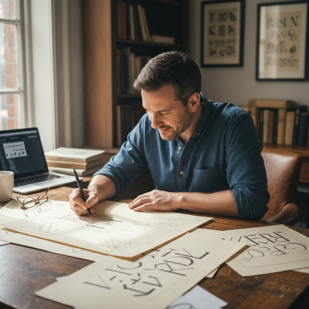
The walk-up on Oranienstraße doesn't have a sign. The studio occupies the back half of the second floor — drawing boards stacked against the radiator, a wall of printed specimens in various stages of red-pen annotation, and a monitor running Glyphs 3 with eleven masters open simultaneously. Jonas Brandt, 34, is interpolating a new weight.
Kiesel Grotesk — "kiesel" meaning pebble in German — ships with a wght axis from 200 to 900 and an opsz axis tuned specifically for the gap between 8pt caption text and 96pt billboard display. The apertures open dramatically as optical size increases — a deliberate reversal of the closed, neutral apertures that made Helvetica so easy to misuse.
"Brand designers need a grotesque that can do everything without doing everything the same," Brandt says, pulling up a comparison between Kiesel's 8pt optical size and its 96pt. The difference is architectural. "At small sizes, you close the apertures to protect legibility. At display sizes, you open them so the reader can breathe. Most fonts just scale. This one transforms."
Worth licensing this quarter
Prices shown are single-user desktop licenses. Web and app tiers vary — see each foundry for full rate cards.
Best-in-class opsz implementation. The aperture shift between caption and display is worth the license alone.
Full review